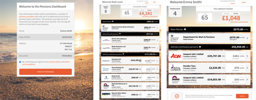
All audiences have a “high likelihood” of using a pensions dashboards, according to qualitative research from the Money and Pensions Service (Maps).
The organisation said it was the ability of the technology to provide a 'big picture' view of their retirement savings, including total pension income, lost savings and state pension information, which contributed to its appeal across audiences.
It noted that even savers who defined themselves as highly engaged with their pensions had knowledge gaps and reasoned that filling these should be a priority, especially for those nearing retirement.
Notable gaps among this group included finding the most tax efficient solution for drawing down their pension and understanding the range of options available.
Meanwhile, less engaged individuals were unsure of what a comfortable retirement income was, as well as what size of pot would provide this comfortable income, whether their current contributions were adequate and how to find their lost pension pots, although it also pointed out that less engaged savers were unsure even of the areas in which they lacked knowledge.
As such, a blog post penned by Maps head of pensions policy and strategy, Carolyn Jones, said the organisation is developing tools and digital guidance that wrap around dashboards in order to help savers understand the information presented to them.
The qualitative research found that tools which would allow users to play around with contributions, retirement ages, lifestyles and retirement options were seen as the most valuable, although the importance of user-friendliness was stressed.
Jones said the organisation is also looking at establishing signposting to other guidance and advice services as it saw the dashboard as “a digital entry point to all of Maps’ other services”.
She continued: “Beyond retirement planning we need to ensure that consumers get the support the need to act safely on the information that they see on dashboards.
“For example, should someone decide they want to look into consolidating their pensions as a result of what they find on their dashboard, they need to know how to do that safely and avoid potential pitfalls, or worse, scammers.”
She noted that the research conducted by Maps and the Pensions Dashboards Programme (PDP) had shown a widespread positive reaction to the concept of dashboards, adding that the former had used the research as an opportunity to work out what users might want from dashboards.
Jones added: “We’re relatively agnostic about which dashboard someone uses, if it helps us achieve the goal of helping more people to plan effectively for later life. Ultimately, the more people we can get using dashboards and thinking about their retirement planning, the better. We are making both sets of research public to support this ambition.”
Latest News
-
PSB could expose ‘significant data gap’ across UK pensions industry
-
Trustees have 'responsibility and opportunity' to close DB member experience gaps
-
Institutional and wealth sector investment drives LTAF AUM up to £7.3bn
-
Nearly half of UK adults expect to use targeted support
-
Telling the ‘story’ of investments key to boosting DC engagement
-
Employers urged to continue offering salary sacrifice despite changes
Incorporating private markets into DC funds
Laura Blows discusses the role of private market investment within pension funds with Scottish Widows’ head of investment solutions, Mithesh Varsani
Podcast: From pension pot to flexible income for life

Podcast: Who matters most in pensions?

In the latest Pensions Age podcast, Francesca Fabrizi speaks to Capita Pension Solutions global practice leader & chief revenue officer, Stuart Heatley, about who matters most in pensions and how to best meet their needs
© 2019 Perspective Publishing Privacy & Cookies


Recent Stories